


How Do You Make An 80s AI Photo For Instagram?
Pick the source photo that survives the conversion, then write a prompt that protects your face. Everything after that is a format decision.
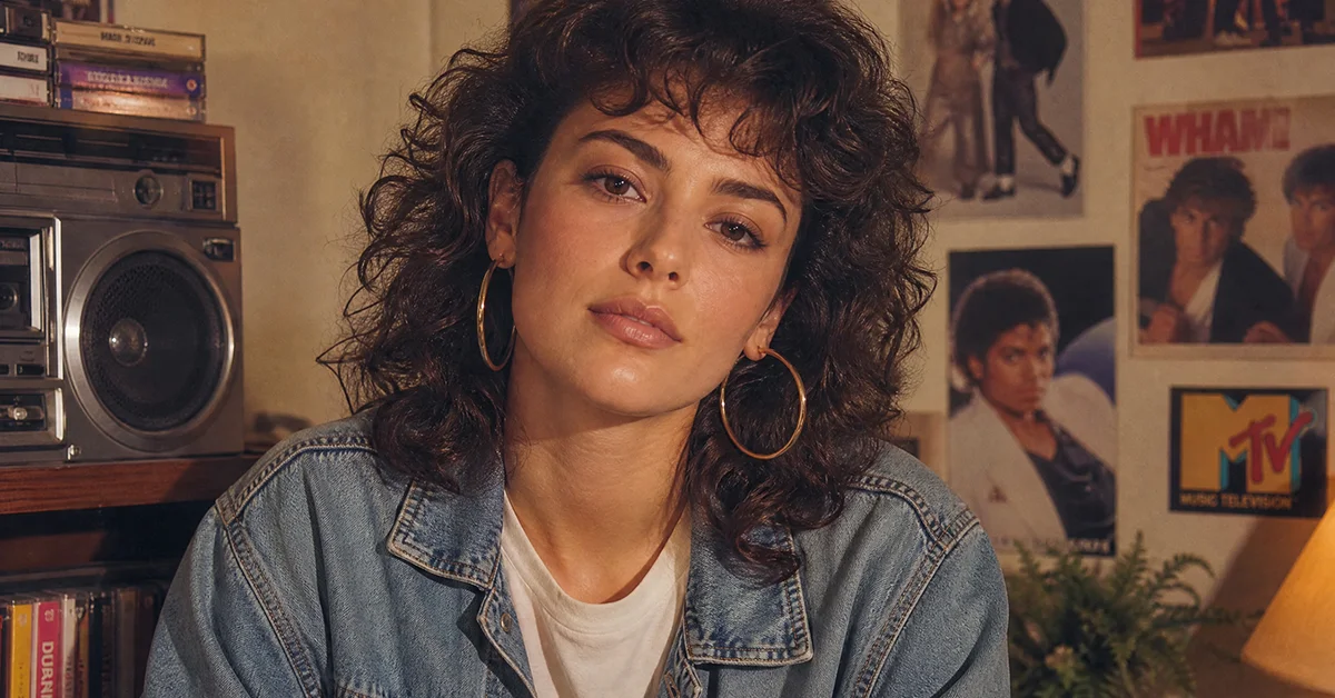
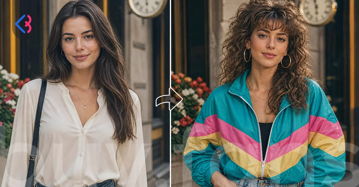
Feed a sharp, front-facing photo into an AI image tool, write an English prompt that describes the 1980s look and orders the model to keep your face unchanged, generate a 4:5 frame, then post it as a feed post or the opening slide of a carousel. The rest is refinement.
One correction before you start. There is no effect to search for inside Instagram, because this is not an Instagram filter. The image is produced outside the app by a generative AI tool and uploaded like any other photo, so your result depends on what you hand over rather than on the Instagram camera.
What follows is a set of decisions rather than a tour. Which photo to upload, what to type, what ratio to export, and where the finished image belongs. Skip whatever you have already settled.
Which Source Photo Actually Works For This Trend?
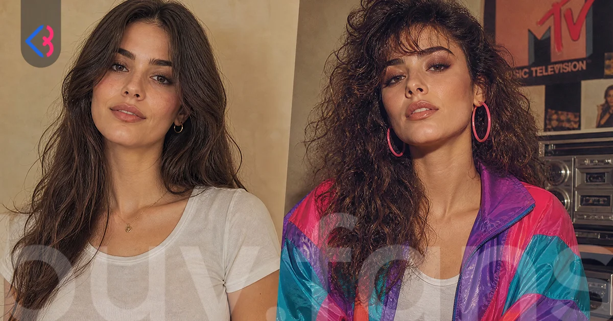
A sharp, evenly lit photo where your face fills a decent part of the frame and nothing sits between the camera and your features. That is close to the whole requirement. Models rebuild what they can see and invent what they cannot, so the quality of the reference photo sets your ceiling.
The most common failure has nothing to do with the prompt. Someone uploads a group shot from a night out, crops themselves out of it, and hands over a face that occupies a sliver of the frame under one orange bulb. The model gets almost no facial information, so it fills the gap with an average face. Then the prompt gets blamed.
Daylight beats indoor lighting, and a plain wall beats a busy background. Shoot at eye level; a camera held low distorts the proportions the model then rebuilds. Sunglasses, heavy shadow across one cheek, motion blur and hair falling over an eye all cost you likeness, and no wording recovers them later.
| Photo trait | What the model does with it | Do this instead |
|---|---|---|
| Face small in frame, heavily cropped | Invents the features it cannot see | Use a frame where head and shoulders fill most of the image |
| Strong side shadow or one coloured light | Rebuilds the shadowed half incorrectly | Face a window in daylight |
| Sunglasses, mask or a hand near the chin | Removes them and guesses what is underneath | Choose a frame with the full face visible |
| Motion blur or low resolution | Returns a soft, generic person | Pick the sharpest file you own, even an older one |
| Busy background with people or signage | Competes for attention and can trigger a refusal | Plain wall, door or open sky behind you |
| Extreme angle from below or above | Warps jaw and forehead proportions | Camera at eye level |
| Visible brand logo or licensed character on clothing | May be refused outright | Plain clothing in the source frame |
Two habits are worth breaking before you upload. Screenshots throw away data, so send the original file rather than a screengrab pulled from a chat. And a selfie already smoothed and reshaped by an image editing app hands the model a face that is not quite yours, so the output cannot be either.
Go through your camera roll before you open any tool. Shortlist a few candidates, then rank them on face size, lighting and sharpness in that order.
How Do You Write An English Prompt That Holds Your Face?
Put the identity instruction before the styling instruction. The short version circulating everywhere, "What would I have looked like in the 80s?", returns a 1980s aesthetic image of somebody who is not you. It asks for a period, not for a person, and the model answers exactly what was asked.
A prompt that holds face preservation does its jobs in a fixed order. It states what must not change, names the era with specifics instead of the word "80s", describes the photographic treatment, then fixes the frame. Drop the first job and you get a stranger in a denim jacket. Drop the third and you get a modern photo wearing period clothes.
Be concrete about the decade. "80s style" carries almost no information; "studio portrait, soft frontal light, neon palette of magenta and cyan, shoulder pads, big hair, visible film grain" carries a great deal. Period detail is where prompt writing pays off, and it is the block most people leave empty.
| Prompt block | What it controls | Wording that works |
|---|---|---|
| Identity lock | Whether the output is you | "Keep the face, bone structure, skin tone and eye colour of the uploaded person exactly as they are" |
| Era styling | Clothing, hair, colour | "1985 studio portrait, feathered big hair, shoulder pads, denim jacket, magenta and cyan gel lighting" |
| Photographic treatment | Texture and realism | "Shot on 35mm film, visible grain, slight halation, soft focus falloff" |
| Framing | Crop and ratio | "Head and shoulders portrait, vertical 4:5 frame, subject centred" |
| Negative instruction | What to suppress | "Do not smooth or reshape the face, do not change age, no text, no watermark" |
Order matters more than length. Models weight the opening of a prompt heavily, so the identity lock belongs in the first line rather than tacked on at the end. When a result comes back close but not right, change one block and regenerate instead of rewriting everything.
Leave the vague adjectives out. Words like "beautiful" and "perfect" push the model toward a generic idealised face, which is the opposite of what this trend needs. Describe the decade, describe the camera, and let your own features carry the rest.
Ready-To-Copy Prompt Templates For One Person And For Groups
Two templates follow. Paste one, swap whatever sits inside the brackets, and attach your source image in the same message rather than in a separate one.
Using the uploaded photo as the reference, create a 1985 studio portrait of this exact person.
Preserve the face, bone structure, skin tone, eye colour and apparent age exactly as they appear in the reference. Do not beautify, slim or reshape the face.
Styling: [feathered big hair / permed volume], [denim jacket / satin blouse / blazer with shoulder pads], period-accurate makeup.
Lighting and colour: soft frontal light with magenta and cyan gel accents, pastel gradient backdrop.
Photographic treatment: shot on 35mm film, visible film grain, gentle halation on the highlights, slight lens softness.
Framing: head and shoulders, subject centred, vertical 4:5 frame.
No text, no watermark, no logos.
The group version needs one instruction the single portrait does not, so do not simply pluralise the template above.
Using the uploaded photo as the reference, create a 1985 studio portrait of these exact people.
Preserve each person's face, bone structure, skin tone, eye colour and relative height exactly as in the reference. Keep them in the same left-to-right order. Do not merge, swap or average their features.
Styling: coordinated period outfits, [denim and leather / pastel knitwear], shoulder pads, big hair, period makeup.
Lighting and colour: warm studio front light, soft magenta rim light, mottled pastel studio backdrop.
Photographic treatment: shot on 35mm film, visible grain, slight colour shift in the shadows.
Framing: waist-up group portrait, everyone facing camera, vertical 4:5 frame.
No text, no watermark, no logos.
That left-to-right line does more work than it looks like it does. Group generations drift, and faces trade places between people whenever the model has no positional anchor to hold. One extra line saves you a regeneration.
Swap the year and the styling block to move the look without rebuilding the prompt. A 1980 frame reads softer, while 1990 pulls toward flatter colour, so the same skeleton covers a range of retro aesthetic results. If anyone else appears in your source photo, ask them before you upload it. A friend may be relaxed about a portrait of themselves and may not be, and that is a question to settle before the file leaves your phone.
Which AI Image Tool Should You Pick?
Any tool that accepts an uploaded photo and generates from it will do this job, so pick on behaviour rather than on brand. The trend spread mainly through general assistants such as ChatGPT and Google Gemini, and a range of third-party photo apps produce comparable output. No single option is correct for everyone.
A few things separate them once you actually sit down with one:
- Does it take your photo as a reference, or generate from text alone? Text-only tools cannot preserve your face at all, which rules them out immediately.
- Can you refine in conversation? Saying "keep everything, make the hair bigger" saves far more time than restarting from a blank prompt each attempt.
- What comes out the other end? Output resolution varies widely, and a small image looks soft the moment Instagram scales it up.
- What does the free tier allow? Free access usually carries a daily generation limit, and once you reach it you wait for the reset or move elsewhere.
Assistants tend to win on iteration and prompt control, since you can argue with them. Dedicated photo apps win on speed and one-tap presets, at the cost of telling the model precisely what you want. Anyone chasing a specific look will get further with a conversational tool; anyone who wants a decent image quickly will not.
Plan around that daily ceiling rather than discovering it mid-session. Generate the variations you want while you still have capacity, save them all, and publish from your own library across the days that follow.
What Aspect Ratio Should You Generate And Post In?
Generate at 4:5 for anything going to the feed, 9:16 for Story and Reels, and 1:1 only when your grid layout demands it. The 80s photo aspect ratio question usually ends right there, and the reason 4:5 wins is plain: it is the tallest shape the feed displays without cropping, so it takes the most screen from a scrolling viewer.
Ask for the ratio inside the prompt, then check what actually arrived. Some tools return a square whatever you requested, and stretching that to 4:5 afterwards either cuts hair off the top or pads the frame with invented background.
| Aspect ratio | Where it belongs | What re-encoding does to grain |
|---|---|---|
| 4:5 | Feed post, carousel slides | Holds texture reasonably well at full width |
| 1:1 | Grid-driven profiles and older layouts | Grain survives, but you give up vertical screen space |
| 9:16 | Story, Reels | Heaviest re-encode, fine grain smears first |
Compression is the part almost nobody warns you about. Film grain is fine high-frequency noise, which is exactly what image compression discards first, so the analogue texture you spent a prompt describing can arrive on a follower's screen as mush. Ask for coarser grain, keep contrast slightly higher than feels natural, and upload the original export instead of a re-saved copy.
Video treats texture worse than stills do. If the grain is the point of your post, a static frame keeps more of it than a Reel will, and that alone feeds into the format decision below.
Feed Post, Carousel, Reel Or Story?
One strong image goes to the feed, several go to a carousel, a before and after goes to a Reel, and anything you are unsure about goes to a Story. The choice is not about which format wins in the abstract. It follows from what you actually produced.
| Format | Use it when you have | What the viewer does with it |
|---|---|---|
| Single feed post | One result you are confident in | Looks, reacts, scrolls on |
| Carousel | Several variations, or the output beside the original | Swipes, and stays on the post longer |
| Reel | Two frames worth animating between | Watches, often more than once |
| Story | A test, or a poll between two versions | Replies, votes, and it clears in a day |
The carousel is the format most accounts underuse here. Put the retro result on the first slide and the untouched original behind it, and the post carries its own reason to swipe. Choosing between a Reel and a carousel for a trend post comes down to whether the transition between those images is interesting enough to watch, or only interesting enough to look at.
A Story is the cheapest way to test a weak generation. Publish the version you are unsure about, read the replies, and promote the winner to the feed the next day. The weaker attempt never reaches your grid.
When Should You Post While The Trend Is Still Live?
Post while people still recognise the format on sight, which for a fast-moving visual trend means days rather than weeks. Recognition is the whole advantage a trend hands you. Once a look stops registering as current, the same image lands as an ordinary photo.
Work in a sensible order. Generate as soon as you decide to join, publish your strongest result first instead of saving it, and space the remaining variations out rather than posting them in one burst. Followers scrolling past a run of near-identical retro portraits stop reacting to the last of them.
Early movement shapes what happens afterwards, because a post that gathers reactions in its first hours is the one people pause on later in the day. Creators who want that early activity on a launch post sometimes buy Instagram likes to give the upload a base while organic engagement builds. Treat it as a starting push and nothing else, since the image still has to earn the swipe on its own. Trend content can surface on the Explore page, though nobody can promise that for any individual post.
Caption work deserves more attention than it gets. Say what the source photo was and what you asked for, because the process is half the interest for anyone weighing up their own attempt. A question invites replies; a lone emoji invites nothing.





Keeping The Account Consistent After The Trend Fades
A trend post is a spike, not a direction. Accounts that gain something lasting are the ones whose next post looks like it came from the same place, and the ones that lose their new arrivals either go quiet or swerve into something unrecognisable.
Decide on the follow-up before you publish the retro image. If the 1980s aesthetic genuinely suits your account, carry one element forward rather than the entire look, perhaps the warm colour grade or the grain, applied to your usual subject matter. If it does not suit you, treat the post as a one-off and return to your normal rhythm.
Keep the raw files. Trends resurface and adjacent looks arrive constantly, so a folder of source photos that already generate cleanly is worth more than the finished images. When the next visual format lands, you will be choosing a prompt rather than hunting for a usable face.
One last thing protects you long after the trend passes. Nobody is fooled by a retro portrait, and presenting it as a genuine photograph from the past invites the wrong sort of comment. Say it came from AI, keep the tone light, and the post ages better than the trend that carried it.
This article was last updated on 18 October 2026 sunday. Today, 20 visitors read this article.